
Branding
Guides covering brand identity, visual language, and brand strategy.
Web Design
Guides covering website management, CMS platforms, and site updates.
Ecommerce
Guides covering online store setup, product management, and order fulfilment.
Marketing
Guides covering email, social media, SEO, and digital advertising.
Get Assistance
Send us a message and we'll get back to you as soon as possible.
Introduction
Getting started with your new Shopify store.
Welcome to Your Website
Welcome to your new Shopify website, built and delivered by Mind Pattern Studio.
This platform has been designed to give you full control over your online store, allowing you to easily manage products, collections, and site content without needing any technical experience. Whether you're adding new products, updating existing listings, or organising your storefront, everything can be handled through Shopify's intuitive admin system.
This guide will help you get up and running confidently, and serve as an ongoing reference as you manage and grow your store.
Need Help?
If you require any technical assistance or run into any issues while managing your website, we're here to help.
Don't hesitate to get in touch for support, guidance, or further training — whether it's a quick question or something more in-depth, we'll ensure you have everything you need to keep your site running smoothly.
How to Use This Guide
A brief overview of how this documentation is structured.
This guide has been created to walk you through the key areas of your Shopify website step by step. Each section focuses on a specific part of the system — such as products, collections, or navigation — with clear instructions on how to complete essential tasks.
You can either:
- Follow the guide from start to finish to build a full understanding of the platform, or
- Jump to specific sections when you need help with a particular task
Where relevant, we've also included tips and best practices to help you keep your website consistent, professional, and easy to navigate for your customers.
No prior experience with Shopify is required — simply follow the steps provided, and you'll be able to confidently manage your website.
Terminology
Common Shopify terms you'll encounter when managing your website.
Before getting started, here are some common Shopify terms you'll see when managing your website.
Individual items you are selling. Each product has its own page with images, description, price, and details.
Different versions of a product, such as size or colour, kept under one listing. These are important to add (even if a product only has one variant) as Filters sometimes require these to narrow down products on a collection page.
Customer purchases. Managed in the Orders section for fulfilment and updates.
In Shopify, vendors are used to represent the brand or supplier behind a product. Each product should be assigned to the correct vendor so it can be filtered and organised accordingly.
Groups of products. These act as your website categories, helping customers browse, such as "New In" or "Footwear".
Automatically generated collections based on rules you set, such as product tags, vendor, or product type. This is the main type of collection used on your site to keep things organised without manual sorting. For example, a "Sweatshirts" collection might have the condition: Product Type is equal to Sweatshirt.
Labels added to products to help organise them. Used for filtering, searching, or building smart collections.
Your stock levels. Shopify tracks how many units you have available.
Custom fields used to add extra information to products, beyond the standard Shopify fields. These are configured specifically for your store and can be used to display additional details on product pages.
Options on collection pages that help customers narrow down products, such as size, designer, or category. These are usually powered by tags or product data.
The menu customers use to move around the site. Links to products, collections, or pages.
Standard content pages like About, Contact, or FAQs.
Shopify's reporting area where you can view visitors, sales, customer behaviour, and store performance.
Where all uploaded images and files are stored. This is used when adding product images or updating site content.
Accessed on the left hand panel of the dashboard. This is where you manage the design and layout of your website, including templates, sections, and overall page structure across the site.
The overall structure of your website. Themes control how your site is laid out and how pages function. You can customise them, but do not remove a theme unless absolutely necessary.
A standardised numerical code used internationally to classify products for customs and shipping purposes. Also known as an HS (Harmonised System) code, it is used by couriers and customs authorities to identify what a product is, calculate applicable duties or taxes, and ensure compliance when shipping internationally. For example, a jacket may have the code 6201.93. Adding these in Shopify ensures the correct code is passed to your courier automatically when fulfilling orders.
Becoming the Store Owner
Accept ownership of your Shopify store before getting started.
Before managing the website, you'll need to accept ownership of the Shopify store. This gives you full control over all areas of the site, including products, orders, and settings.
Steps
Once completed, you'll have full access to manage your store and can continue with the rest of this guide.
Billing Setup
Select a Shopify plan and add your billing details to keep the store active.
To keep your store active, you'll need to select a Shopify plan and add billing details.
Steps
Note: In some cases, a 3-month trial may already be active, so you may not need to select a plan straight away.
- View invoices
- Download receipts
- Update your payment method
Your billing is now set up and the store will remain active.
Setting Up Payments
Configure payment methods so customers can complete purchases.
Before you can start taking orders, you'll need to set up your payment methods. This ensures customers can complete purchases and funds are paid into your account.
Steps
- Business name and address
- Bank account details (where payouts will be sent)
- Personal details for verification
Your store is now ready to accept payments.
You can also add additional payment methods in this section, such as Clearpay or Klarna, if you wish to offer flexible payment options to customers.
Adding a Product
How to add new products to your Shopify store.
Adding a new product to your store is straightforward when following best practice. To keep your workflow consistent, we recommend starting by duplicating a similar existing product and updating the necessary fields.
Steps
- Enter the Product Title
- Uncheck Media and Inventory Quantities
- Set Product Status to Draft
Further details such as variants and pricing will be added in the steps below.
- Important: This must match the collection type for the product.
- If you duplicated from a similar product, this may already be set correctly.
Scroll down to the Shipping section and enter the product's Harmonized Code (also called an HS or commodity code).
This data is pushed to your courier and is mandatory for international orders. You can add the code when shipping manually, but best practice is to add it in Shopify — this way the HS code carries over automatically if you duplicate the product in future.
Important: If you have duplicated this product from another listing, always check and update the HS code — do not leave a code that belongs to a different product type.
Metafields (Extra Product Details)
These fields allow extra information to display on the product page:
Scroll down to the metafields section and fill in any custom fields configured for your store. These will vary depending on your setup, but may include things like:
- Product Type / Category Required
- Additional descriptions or specifications Optional
- Custom display options Optional
Only fields relevant to your store will appear here. If you're unsure what a field is for, refer to this guide or contact us.
- Scroll to the top and set Status to Active if you want the product live.
- Otherwise, leave as Draft to save and return later.
Your product has now been created. If you set it to live, it will appear in the relevant categories on your website.
Depending on your store setup, new products may receive tags automatically when published — for example, a "New In" tag that adds them to a featured collection. These automations can be adjusted if needed, so just let us know.
If your store uses tags to power Smart Collections or filters, make sure any required tags are applied correctly when creating each product.
Creating a Collection
How to set up a new Smart Collection on your store.
Your store is set up predominantly using Smart Collections rather than manual ones.
A smart collection automatically pulls in products based on rules you define, such as product type, tags, or designer. This means you don't need to manually add products to collections.
As you add new products, they will automatically appear in the correct collections, keeping everything organised and improving the customer experience — with no manual sorting required.
Steps
- Change the first dropdown to Product type
- Leave the condition as is equal to
- Enter the collection name in the final field
Important: This must exactly match the Product Type used on your products.
Scroll back to the top and press Save.
Optional: Add a Collection Image. Some areas of the site use this image, so it's recommended if the collection will be displayed with a thumbnail.
Once set up correctly, any matching products will automatically appear in this collection.
Managing Orders
View, fulfil, and manage customer orders from your Shopify admin.
Once your store is live, all customer purchases will appear in the Orders section. This is where you can view, fulfil, and manage any issues with orders.
Viewing Orders
Marking an Order as Fulfilled
Refunds & Cancellations
Cancelling an Order
Shipping
Control how customers are charged for delivery and where you ship to.
Shipping settings control how much customers are charged for delivery and where you ship to. In Shopify, this is managed using Rates, Markets, and Shipping Profiles.
Rates: The cost of shipping charged to the customer (e.g. £5 standard delivery, free shipping over £100)
Markets: The countries or regions you sell and ship to (e.g. UK, Europe, International)
Shipping Profiles: Groups of products that share the same shipping rules
Accessing Shipping Settings
Setting Shipping Rates
Enter the following:
- Rate name (e.g. Standard Shipping)
- Price (or set conditions like free shipping over a certain amount)
Managing Markets (Shipping Regions)
Using Shipping Profiles
Shipping profiles allow you to apply different shipping rules to different products.
Checklist
Track your progress as you get your store set up and running.
Use this checklist to work through the key tasks for getting your store set up and running. Tick each item off as you complete it — your progress is saved in your browser.
Getting Started
Products
Collections
Navigation
Orders
Shipping
If you get stuck on any of these tasks, use the Need Assistance? button to send us a message and we'll help you get sorted.
Logo File Types
& How to Use Them
Understanding which format to use and when.
When you receive your logo from Mind Pattern Studio, it will be provided in a range of file formats. Each format serves a different purpose — some are for professional print production, others for digital use, and some for everyday sharing. Understanding the difference will help you use your brand assets correctly and ensure your logo always looks its best.
At the heart of this is one fundamental distinction: the difference between vector and raster graphics. Everything else follows from that.
Store your logo files in a dedicated folder and back them up to a cloud service like Google Drive or Dropbox. Always send the correct file type when working with designers, printers, or developers — using the wrong format can result in a blurry or low-quality result.
Vector vs Raster
Understanding the difference: how digital images are built.
Digital graphics are created in two fundamentally different ways, and understanding which type you're working with determines how and where you should use it.
Vector
Vector images are built from mathematical paths and shapes — lines, curves, and points defined by equations. Because they use maths rather than pixels, they can scale to any size without any loss of quality. A vector logo can go from a business card to a billboard and remain perfectly crisp at every size. Vector files are also editable, meaning a designer can adjust colours, shapes, and text at any stage.
Raster
Raster images are made up of a fixed grid of pixels, where each pixel holds a colour value. The quality of a raster image is tied directly to its resolution — the number of pixels packed into a given area. Enlarging a raster image beyond its original resolution causes it to appear blurry or pixelated, as the software has to invent pixel data that wasn't there. Raster files are best suited for photographs and images with complex colour gradients.
Use vector formats (AI, SVG, PDF) whenever possible for your logo — especially for printing, signage, or sending to other designers. Use raster formats (JPG, PNG) for everyday digital use, social media, and anywhere a vector isn't supported.
File Types
A reference guide to every format you'll receive with your logo.
Vector Formats
These files are resolution-independent and will remain sharp at any size. Use these for professional print, production, and working with designers.
AI is Adobe Illustrator's native vector format. It stores artwork as mathematical paths, meaning it can be scaled to any size — from a favicon to a building wrap — without any loss of quality. AI files are fully editable, making them the preferred format for professional designers and print suppliers. Always provide an AI file when working with a printer or production company.
SVG is the standard vector format for the web. Built using mathematical paths rather than pixels, SVGs remain perfectly sharp on all screen sizes and pixel densities — including Retina and 4K displays. They are lightweight, support full transparency, and can be embedded directly into websites or styled and animated with code. SVG is the ideal format for your logo on any digital platform.
PDF is a versatile format that can contain both vector and raster elements. When a logo is saved as a vector PDF, it scales cleanly at any size. PDFs are universally supported across operating systems and devices, making them the safest format for sharing final artwork with clients, printers, or anyone who needs to view or print your logo without specialist software.
Raster Formats
These files are made of pixels and are resolution-dependent. They are best suited for digital use, photography, and platforms that do not support vector files.
JPG is the most common raster format, designed for photographs and complex images with gradients. It uses compression to reduce file size, which makes it fast to load online — but this compression discards some image data, so quality can degrade if a JPG is saved and re-saved multiple times. JPG does not support transparency. Use it for photographs and images where a small file size matters more than a transparent background.
PNG is the preferred raster format for logos used in digital contexts. Unlike JPG, PNG uses lossless compression — meaning no image data is discarded — and crucially supports a transparent background. This allows your logo to be placed on any background colour or image without a white box appearing around it. Use PNG when you need your logo on a website, presentation, or digital document and a vector format isn't available.
Image Optimisation
for Faster Websites
How to improve speed, performance, and user experience.
Why Image Optimisation Matters
Images are one of the biggest factors affecting website speed. Large, unoptimised images can slow your website down, increase bounce rates, hurt your search rankings, and reduce conversions.
Optimised images help your website load faster, look sharp, and perform better across all devices. The good news is that getting this right doesn't require specialist software — just an understanding of the basics covered in this guide.
Image optimisation is one of the simplest and most effective ways to improve your website's performance. Even basic improvements — like resizing images correctly before upload — can make a noticeable difference to loading speed.
Choosing the Right Format
Different file types serve different purposes.
Choosing the correct file format is the first step in image optimisation. Using the wrong format — such as a PNG for every image — leads to unnecessarily large files and slower loading times.
Best for photography and detailed images. JPG uses compression to reduce file size, making it well-suited for photographs and images with complex colour gradients. It does not support transparency.
Best for graphics that need transparency. PNG uses lossless compression and supports transparent backgrounds, making it ideal for logos and interface graphics on digital platforms.
Ideal for logos and icons. SVG is a vector format, meaning it scales to any size without losing quality. It is the most efficient format for logos and simple graphics used on websites.
WebP — The Recommended Format
WebP is a modern, highly efficient image format designed for the web. It produces smaller file sizes than both JPG and PNG while maintaining high visual quality, which directly improves loading speed.
Some platforms — including Shopify — automatically convert images to WebP when serving them to visitors. If your platform doesn't do this automatically, it's worth exporting images in WebP format where possible.
For most web images, WebP is the best choice. If WebP isn't supported by your platform, use JPG for photographs and PNG for graphics requiring transparency.
Image Size & Resolution
Uploading images at the right dimensions for where they'll appear.
One of the most common causes of slow websites is uploading images that are far larger than they need to be. A photograph straight from a camera can easily be 5,000px wide and several megabytes in size — far beyond what any website needs.
Resolution — Pixel Dimensions
Resolution refers to the width and height of an image in pixels. Before uploading an image, resize it to match the space it will occupy on the page. As a general guide:
Around 1920px wide. Used for hero banners and full-bleed backgrounds.
1000–1500px wide. Used for product images, blog photos, and inline content.
300–600px wide. Used for grid listings, related products, and small previews.
DPI — Dots Per Inch
DPI is a measurement that causes a lot of confusion. It is primarily relevant for print — determining how many ink dots are placed per inch of paper. For websites, it has no direct impact.
Websites render images based entirely on pixel dimensions, not DPI. A 72 DPI image and a 300 DPI image with identical pixel dimensions will look identical on screen. What matters for web performance is the pixel size and the file weight, not the DPI value.
When preparing images for your website, focus on getting the pixel dimensions right for the space they'll fill, then compress the file. DPI can be ignored for web use.
Compressing Images
Reducing file size without noticeably affecting quality.
Even correctly sized images can still carry more data than necessary. Compression reduces the file size of an image — often significantly — without a visible difference in quality to the viewer. Smaller files mean faster page loads, better user experience, and improved SEO performance.
Types of Compression
Achieves smaller file sizes by permanently removing some image data. The quality reduction is usually imperceptible at moderate compression levels. JPG and WebP both use lossy compression. This is the most effective approach for photographs and general-purpose web images.
Reduces file size without discarding any image data, so quality is fully preserved. The file size reduction is less dramatic than lossy compression. PNG uses lossless compression. Use this when image integrity is critical — such as logos and product graphics where sharpness must be maintained.
How to Compress
There are several free tools available for compressing images before uploading them to your website:
- Squoosh (squoosh.app) — browser-based, no install required, supports WebP export
- TinyPNG / TinyJPG (tinypng.com) — simple drag-and-drop compression
- ImageOptim (imageoptim.com) — Mac app for batch compression
Optimising for Use Cases
The right approach for each type of image.
Different types of content have different requirements. Applying the right combination of format, dimensions, and compression for each use case ensures the best quality at the smallest possible file size.
Use JPG or WebP. Apply lossy compression before uploading. Never upload full-resolution camera images directly — resize to the appropriate pixel dimensions first. A typical product or editorial photo should be under 200KB after compression.
Use PNG or WebP. Keep dimensions as small as possible for the space they'll fill. PNG is best when transparency must be preserved and WebP isn't supported. Compress using lossless tools before uploading.
Use SVG wherever possible. SVG files are resolution-independent and typically very small in file size, ensuring crisp rendering on all screens — including high-density Retina displays — without any performance cost.
Responsive Images
Serving the right image size to the right device.
Modern websites are viewed on a wide range of devices — from large desktop monitors to small mobile screens. A full-width desktop image at 1920px wide contains far more data than a mobile screen can use or display, yet without responsive images, that oversized file is sent to every visitor regardless of their device.
Why It Matters
Serving correctly sized images to each device has a direct impact on mobile loading times. Mobile users typically have slower connections and less processing power than desktop users, so unnecessarily large images hit them hardest. Google also uses mobile page speed as a ranking factor, so responsive images contribute to search performance as well as user experience.
How It Works
Most modern website platforms — including Shopify and WordPress — handle responsive images automatically. When you upload an image, the platform generates multiple sizes and serves the most appropriate one based on the visitor's screen. If you're working with a developer or a platform that doesn't handle this automatically, responsive images can be implemented using the HTML srcset attribute, which provides the browser with a list of image sizes to choose from.
If your website is built on Shopify or a modern CMS, responsive images are likely already handled for you. The most important thing you can do is ensure the source image you upload is correctly sized and compressed before it enters the system.
Common Mistakes
What to avoid when preparing and uploading images.
Most image performance problems come from a small set of recurring mistakes. Being aware of these makes it straightforward to avoid them.
Camera images are captured at the highest possible quality, often at 4000–6000px wide and 5–20MB in size. Uploading these directly means your website is serving images that are far larger than needed, significantly slowing down load times. Always resize and compress before uploading.
PNG produces larger files than JPG or WebP for photographs and images without transparency. Defaulting to PNG for all images — especially photos — results in unnecessarily heavy files. Use PNG only when transparency is required.
WebP offers significantly better compression than JPG and PNG with comparable visual quality. Platforms that support it — including Shopify — already serve WebP automatically. For other platforms, manually exporting images as WebP before upload is a simple way to reduce file sizes.
Resizing an image to the correct pixel dimensions is only half the job. An uncompressed 1200px image can still be several megabytes in size. Run images through a compression tool before uploading to ensure the file weight is as small as possible.
Uploading a 300px thumbnail image into a space that displays at 1200px results in a blurry, pixelated image. Equally, uploading a 1920px image for a small thumbnail wastes bandwidth. Match your image dimensions to the space they're intended to fill.
Choose the right format, resize to match the display space, compress before uploading, and use WebP where supported. These four steps cover the vast majority of image optimisation for any website.
When to Use Each Logo Variation
A quick reference for using your logo correctly across different situations.
Why This Matters
You've been provided with multiple versions of your logo so it can be used effectively across different platforms, formats, and backgrounds. Using the correct variation helps maintain consistency, ensures your logo is always clear and legible, and keeps your brand looking professional wherever it appears.
Understanding Your Logo Variations
Your logo suite has been designed to be flexible. While each version serves a slightly different purpose, they all work together as part of one consistent identity.
Your default choice in most situations. This is the main version of your brand and should be used anywhere there is enough space to display it clearly — your website, presentations, marketing materials, and printed documents. When in doubt, use this version.
For situations where space is more limited horizontally. Particularly useful for website headers, navigation bars, and banners where a compact, horizontal layout fits better than the full version. Not all logo suites include this variation.
A simplified version of your logo designed to remain clear at small sizes. Works well for social media profile images, favicons, app icons, and subtle branding elements. This version should complement your primary logo — it should not replace it in key brand placements where the full logo would fit.
Light & Dark Versions
Choosing the right version for the background it sits on.
To ensure your logo remains visible across different backgrounds, you've been provided with both light and dark variations. Choosing the correct version is essential for maintaining contrast and ensuring your logo is always easy to read.
Use on light or white backgrounds. This is typically the version you'll use most often — on white websites, light-coloured printed materials, and presentations with a white or pale background.
Use on dark or coloured backgrounds. This version ensures your logo remains visible and legible when placed on photography, dark-coloured sections of a website, dark printed materials, or branded merchandise with a dark base.
The right choice is always the version that provides the strongest contrast against the background. Avoid placing a dark logo on a dark background, or a light logo on a white background — your logo will disappear or become hard to read.
File Formats
Using the right format for where the logo is being applied.
Your logo files have been supplied in a range of formats to suit different uses, including both print and digital applications. Each format has a specific purpose, so it's important to use the correct one depending on where the logo is being applied.
For a complete explanation of each file type and when to use them, refer to the Logo File Types & How to Use Them guide.
As a quick reference:
Use when working with professional printers, signage companies, or other designers. These vector formats can scale to any size without any loss of quality.
Use for websites and digital interfaces. SVG is the most efficient format for your logo on any digital platform, remaining sharp on all screen sizes including Retina displays.
Use for everyday digital applications — presentations, documents, social media, and anywhere a vector format isn't supported. PNG supports transparency, so your logo will sit cleanly over any background.
Use only when a platform doesn't accept PNG or SVG, and a transparent background isn't required. JPG does not support transparency, so it will always include a background colour behind the logo.
Best Practice
Keeping your logo consistent and professional at every touchpoint.
When using your logo, aim to keep things simple and consistent. Your logo has been designed as a complete system — every variation, colour, and format has been considered. Trust the system and avoid making changes to it.
Never alter, stretch, recolour, or recreate your logo. The supplied files are the definitive versions. If you need a variation that doesn't exist in your files, contact Mind Pattern Studio rather than modifying it yourself.
Always maintain clear space around the logo so it isn't crowded by other text, images, or design elements. A logo that lacks breathing room looks cluttered and loses impact.
Avoid placing your logo on backgrounds that make it difficult to see. Always choose the light or dark version based on what provides the strongest contrast — if neither works well, reconsider the background.
SVG for websites, AI or PDF for professional print, PNG for everyday digital use. Taking thirty seconds to select the correct file makes a real difference to the quality of the end result.
Use your primary logo, choose the version that offers the best contrast against the background, and select the appropriate file format for the platform you're working with. These three decisions will see you right in the vast majority of situations.
Your logo system has been created to give you flexibility while maintaining a strong, consistent brand. By using each variation as intended, you'll ensure your brand always looks polished, professional, and recognisable across every touchpoint.
Why Good Design Improves Marketing Results
Understanding the role design plays in performance, not just appearance.
Design Is More Than Just How Things Look
Design is often seen as a visual layer — something that makes a brand or website look more polished. In reality, it plays a direct role in how your marketing performs.
Every interaction someone has with your brand is influenced by design. From the first impression on your website to the way your content is presented on social media, design shapes how people perceive, trust, and engage with your business.
Good design is not decoration. It is a tool that helps your marketing work.
First Impressions & Trust
Why how you look shapes what people believe about you.
First Impressions Happen Instantly
When someone lands on your website or sees your content for the first time, they make a judgement almost immediately. If your design feels outdated, inconsistent, or unclear, it can create doubt. People may question the quality of your service before they have even read a word.
A well-designed brand and website creates a strong first impression. It builds confidence quickly and encourages people to stay, explore, and engage further.
Design Builds Trust
Trust is one of the most important factors in marketing. Clean layouts, consistent branding, and clear messaging all contribute to a sense of professionalism. When everything feels considered and cohesive, it reassures people that your business is credible and reliable.
On the other hand, inconsistent or poorly executed design can create friction. Even small details like spacing, alignment, or typography can influence how trustworthy your business feels.
Clarity & Understanding
How design helps people absorb your message.
Good design makes information easier to absorb. Through structure, layout, and visual hierarchy, design guides people through your content and helps them find what they are looking for. It highlights what matters, reduces confusion, and makes your message clearer.
Without this, even strong messaging can get lost. If a page feels cluttered or difficult to scan, people are more likely to leave before taking action.
Visual hierarchy is the arrangement of elements in order of importance. It tells people where to look first, what to read next, and where to focus. Good hierarchy makes navigation feel effortless — without it, everything competes for attention at once.
Design Drives Action
Guiding users towards the next step.
Marketing is not just about attracting attention — it is about encouraging action. Design plays a key role in this by guiding users towards the next step. This could be making an enquiry, booking a service, or making a purchase.
Clear calls to action, well-structured pages, and thoughtful use of space all help direct users in the right way. When design is done properly, the journey feels natural and effortless.
A call to action is any element that prompts the user to do something — a button, a link, a form. Design determines how visible, clear, and compelling these are. A well-designed call to action feels like the obvious next step, not an interruption.
Consistency Strengthens Your Brand
Why cohesion across every touchpoint matters.
Consistent design across your website, social media, and marketing materials helps reinforce your brand. When everything looks and feels aligned, it becomes more recognisable and memorable. Over time, this builds familiarity — which is a key part of effective marketing.
Inconsistent design can weaken this. If your visuals change too often or feel disconnected, it becomes harder for people to recognise and trust your brand.
Familiarity breeds trust. The more consistently your brand shows up — with the same colours, typefaces, and visual language — the more recognisable it becomes. Recognition reduces friction and makes people more likely to engage.
It Supports Everything Else You Do
Design as an active part of your wider marketing effort.
Design works alongside your wider marketing efforts. Whether you are posting on social media, running ads, or sending emails, strong design helps your content stand out and perform better. It ensures your message is presented clearly and professionally in every context.
This is why investing in design is not separate from marketing — it is part of it.
Every channel your marketing uses — social media, email, paid advertising, print — is an opportunity to either reinforce or undermine your brand. Consistent, well-considered design across all of them compounds over time, building a stronger and more recognisable presence.
Summary
Design and marketing work best when they work together.
If your marketing is bringing people in, design is what shapes their experience once they arrive. Both need to work together. Without good design, marketing efforts can lose impact. With it, everything becomes more effective.
People form judgements almost instantly. Strong design builds confidence before a single word is read.
Clean, consistent, and cohesive design signals professionalism and credibility.
Visual hierarchy guides people through your content so your message lands clearly.
Well-designed calls to action and page structure guide users naturally towards the next step.
A cohesive visual identity across every channel builds recognition and familiarity over time.
Design is not separate from marketing — it is an active part of what makes it work.
If you are looking to improve how your brand, website, or content performs, we can help refine and evolve your design so it continues to support your marketing as your business grows.
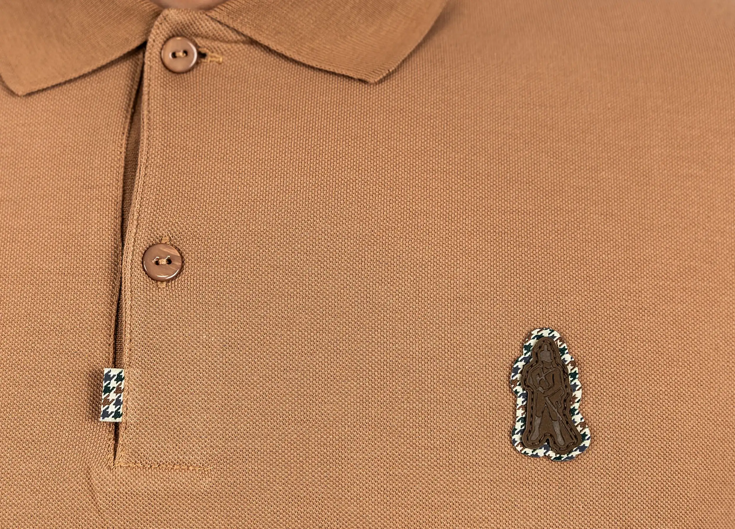
How to Improve Your Product Images and Increase Sales
A practical guide to presenting your products clearly and professionally.
Why Product Images Matter
When customers shop online, they rely entirely on visuals to understand what they are buying. Your product images play a direct role in whether someone trusts your brand, understands your product, and decides to make a purchase.
Clear, consistent, and well-presented imagery helps remove doubt and makes your products more appealing.
Types of Imagery
There is no one-size-fits-all approach.
Different types of products are presented in different ways. The key is to choose an approach that suits your product and your brand, while staying consistent across your store.
Fashion brands often use a mix of clean cut-out images on a white background alongside modelled shots. This allows customers to clearly see the product while also understanding how it looks when worn.
Jewellery brands may use lifestyle imagery or close-up photography to highlight detail, material, and craftsmanship. In some cases, products are styled within a setting to create a more premium or emotional feel.
Most products benefit from a combination of clean product shots for clarity and context shots for engagement. The balance depends on how complex the product is and how much context a customer needs to feel confident buying.
Cut-Out Images on White Backgrounds
One of the most common and effective ways to present products.
This approach keeps the focus entirely on the product and creates a clean, consistent look across your website. The product is cut out from its original background and placed onto a plain white background.
How to Create Them
There are two main approaches — professional editing software and AI-powered tools. Each has its own trade-offs depending on your budget and how complex your products are.
Professional Editing Software
Tools like Photoshop, Affinity Photo, and Canva offer manual or assisted background removal with a high degree of control.
Professional tools give you precise control over the cut-out, making them far better at handling fine details like hair, fur, transparent materials, and complex edges. The result is typically cleaner and more polished.
Most professional tools require a paid subscription, often billed annually. Photoshop is part of the Adobe Creative Cloud suite, Affinity Photo has a one-off purchase model, and Canva's background removal is part of its Pro plan. These costs add up, particularly if you only need the tool occasionally.
AI Background Removal Tools
AI-powered tools — including options built into platforms like Shopify — automate the background removal process without manual editing.
AI tools are generally cheaper than professional software subscriptions. Many operate on a credit or pay-per-use model, making them accessible if you only need to process images occasionally.
AI removal is less precise, particularly with fine details like hair, jewellery, reflective surfaces, or soft edges. You may need to process the same image multiple times to get an acceptable result, which can burn through credits quickly and still not match the quality of a manual cut-out.
Pros of White Background Images
A white background removes all distraction and keeps the focus entirely on the product. When used consistently across your store it creates a professional, cohesive feel.
White background images work well across most ecommerce platforms, product listings, and collections. They are also the standard format expected by many marketplaces.
Cons of White Background Images
Without supporting lifestyle or context images, white background shots can feel clinical. Most stores benefit from using both.
A cut-out image gives no sense of scale, texture in context, or how the product looks in use. Additional images are usually needed to complete the picture for the buyer.
We offer a service to professionally cut out backgrounds and supply clean, web-ready images that are consistent and ready to upload. Get in touch and we can guide you on the best approach for your store.
Lifestyle Photography
Showing your product in use or within a real-world setting.
Lifestyle images help customers better understand scale, context, and how the product fits into their life. They add personality to your brand and can make your store feel more premium.
A jacket shown on a model outdoors gives far more context than a flat product shot. A piece of jewellery photographed in a styled setting can highlight mood and craftsmanship in a way a plain image cannot.
Lifestyle imagery works best when combined with clean product shots rather than replacing them entirely. Use cut-outs for clarity and lifestyle images for engagement and context.
Studio & Location Shoots
Choosing the right environment for your photography.
Studio Photography
Studio photography offers a controlled environment where lighting, background, and composition can be carefully managed. It is ideal for consistency across product ranges, high-quality professional results, and clean product-focused imagery. Studio setups are commonly used for both white background images and more stylised product shots.
Location Shoots
Location shoots take products out of the studio and place them in real environments. This approach can add depth and storytelling, help position your brand, and make products feel more relatable. However, it requires more planning and consistency to ensure images still feel aligned across your store.
Tips for Better Product Images
Simple things that make a real difference.
Use similar lighting, angles, and proportions across your product pages so your store feels cohesive. Inconsistency is one of the most common things that makes an otherwise good store look unpolished.
Show different angles, close-ups, and context shots to give customers a complete understanding of the product. More images reduce uncertainty and increase confidence.
The focus should always remain on the product. Backgrounds — even in lifestyle shots — should complement rather than compete with what you are selling.
Ensure images are high quality but compressed for web so they load quickly without losing clarity. Slow-loading images directly affect bounce rates and conversions. Refer to the Image Optimisation guide for full details.
How to Position Your Website for the AI Era
Getting your business found through modern search tools.
The way people find information online is shifting. Instead of searching and browsing through multiple websites, people are now asking direct questions to tools like ChatGPT and Google. These tools often provide a single, clear answer rather than a list of links.
Because of this, it's no longer just about ranking highly. It's about being the source of that answer.
This is where Answer Engine Optimisation comes in. It focuses on making your website the place that provides clear, useful responses to the questions your customers are already asking.
Creating Content That Gets Picked Up
How to structure your content so AI tools can find and use it.
To improve your chances of being featured, your content needs to be clear, structured, and easy to understand.
Start by focusing on real questions your customers ask. Each question can become its own page or guide.
Structure your content so it is easy to follow. Use a clear title that reflects the question, begin with a short and direct answer, then expand with more detail underneath. This makes it easier for both people and AI tools to quickly understand what your page is about.
It also helps to write naturally. Keep your language simple and conversational — the same way you would explain something to a client.
Making Your Content Easy to Find and Trust
Visibility and credibility go hand in hand.
It is not enough to create useful content. It also needs to be easy to access.
If pages are not linked within your website, they are often seen as less important. A good approach is to create a guides or resources section and link to it clearly, such as in your footer. This helps show that the content is a key part of your website.
Keeping your content updated also plays a role. Regular updates, even small ones, help signal that your website is active and reliable.
Trust is also built by showing that real people are behind the content. Clear information about your business and experience helps reinforce this.
Adding the Technical Layer
A simple piece of code that helps search tools understand your pages.
Alongside your content, there is a simple technical layer that helps search tools understand your pages more clearly.
This is done using structured data. It sits behind your page and provides key details about the content, such as what the page is about and who created it.
Here is a basic example you can use and adapt:
<script type="application/ld+json">
{
  "@context": "https://schema.org",
  "@type": "Article",
  "headline": "ENTER YOUR QUESTION OR PAGE TITLE HERE",
  "description": "A brief 1-2 sentence summary of the answer.",
  "author": {
    "@type": "Person",
    "name": "YOUR NAME OR AGENCY NAME",
    "url": "https://yourwebsite.com/about"
  },
  "publisher": {
    "@type": "Organization",
    "name": "YOUR AGENCY NAME",
    "logo": {
      "@type": "ImageObject",
      "url": "https://yourwebsite.com/logo.png"
    }
  },
  "datePublished": "2026-04-08",
  "dateModified": "2026-04-08",
  "mainEntityOfPage": {
    "@type": "WebPage",
    "@id": "https://yourwebsite.com/your-page-url"
  }
}
</script>
This helps search tools recognise your content and improves your chances of being selected as a source.
Adding structured data to your website can feel daunting if you’re not familiar with code. We can implement it correctly across your pages, so your content is properly marked up and ready to be picked up by AI and search tools.
Turning Website Visitors Into Email Subscribers
How to start capturing emails and why it matters.
Your website might get visitors, but unless you capture their details, most of them will leave and never return. An email list gives you a direct line to potential and existing customers — one you own outright, without relying on social media algorithms or paid ads.
Unlike other marketing channels, your email list is a long-term asset. It grows with your business and stays with you regardless of what platforms change around you.
Why Your Website Should Be Capturing Emails
Your website should do more than inform — it should build your audience.
Every visitor to your website is a potential customer. Most will browse, read, and leave — but if you give them a reason to share their email, you create the opportunity to stay in touch long after they've gone.
A well-placed sign-up form lets you follow up with people who have already shown an interest in what you do. Over time, that means you can share updates, promote offers or new products, and build genuine familiarity with your brand.
Without a way to capture emails, you are relying on visitors to come back on their own. With one, you can bring them back yourself — on your terms, at the right time.
How to Start Building an Email List
Getting started is simpler than most people think.
At its most basic, you need a way for people to enter their email address on your website. This is usually a simple sign-up form connected to an email marketing tool such as Mailchimp, Klaviyo, or similar.
From there, it comes down to two things: placing that form in the right areas of your site, and giving people a clear reason to use it. You do not need a large audience to get started — even a small list built consistently over time becomes a powerful marketing tool as your traffic grows.
A name and email address is all you need to start. Asking for too much information upfront reduces the number of people who will sign up. You can always learn more about your audience later.
Encouraging Sign-Ups
Most people need a reason — make it easy to give them one.
People are unlikely to hand over their email address without understanding what they will get in return. The good news is that the bar is not high — you just need to make the value clear.
Early access to new products, exclusive discounts, or useful content like guides and insights all give people a concrete reason to subscribe. Even a simple "be the first to know" message can be enough if your audience is already interested in what you do.
Tell people exactly what they are signing up for. Vague calls to action — like "join our newsletter" — tend to underperform compared to something specific, such as "get updates on new products and exclusive offers".
Sign-up forms work best when they appear at natural points in the user journey — in the footer, within relevant pages, or after a piece of useful content. They should be easy to find without feeling intrusive or disruptive to the browsing experience.
Keeping It Consistent
List building is a slow burn — but it compounds.
Building an email list is not something that happens overnight. It is a steady process that runs in the background of your website, quietly adding subscribers as your traffic grows.
The most important thing is to keep the opportunity active and visible. Small sign-up touchpoints across your site — maintained consistently over time — will outperform a single high-effort campaign that gets forgotten about.
As your audience grows, so does the value of the list. A few hundred engaged subscribers is worth far more than thousands of social media followers you have no direct way to reach.
From choosing the right email tool to designing sign-up forms that fit your brand, we can handle the setup so your website starts capturing emails in a way that works seamlessly alongside the rest of the user experience.
Understanding Your Website Analytics
A simple guide to seeing how your website is performing.
Your website is not just something that sits online — it should be working for your business. Analytics help you understand what is actually happening on your site: how people are finding you, what they are doing when they arrive, and whether your website is generating enquiries.
Without this, you are essentially guessing at what is working and what needs improving.
Modern analytics tools are designed to be readable by anyone. You do not need to understand code or data science — just a basic familiarity with a few key metrics is enough to make better decisions about your website.
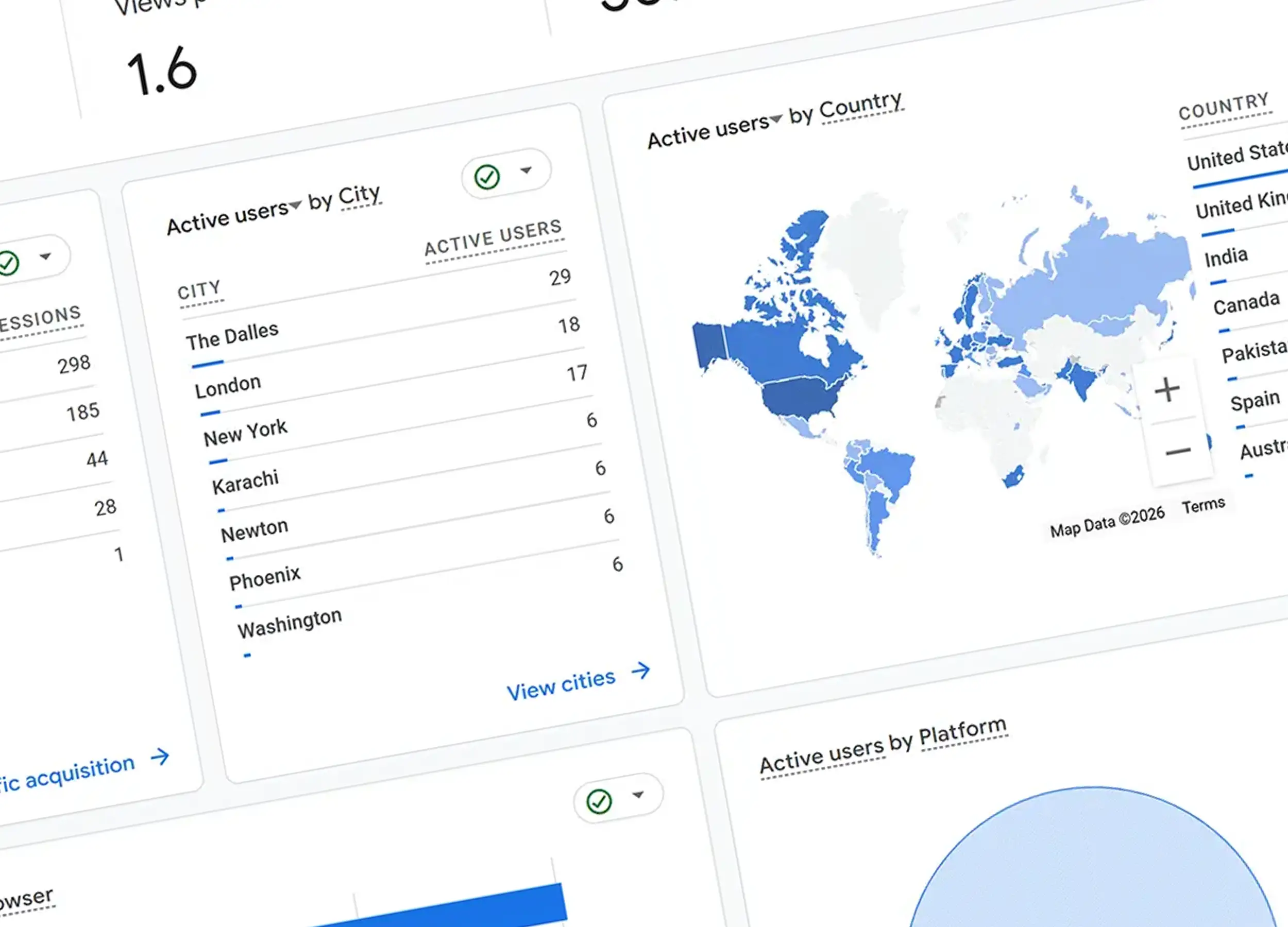
What You Can See From Analytics
A clear picture of how your site is being used.
Website analytics give you a running overview of how your site is performing. At a glance, you can see how many people are visiting, which pages they are viewing, how long they are staying, and where they came from — whether that is a search engine, social media, or a direct visit.
Over time, this builds into a picture of how your website is actually being used and how well it is supporting your business goals.
The number of people visiting your website over a given period. Useful for spotting trends — whether your audience is growing, steady, or declining — and for understanding the impact of any marketing activity.
Where your visitors are coming from. Common sources include organic search (Google), direct visits, social media, and referrals from other websites. This helps you understand which channels are driving people to you.
Which pages on your site are being visited and how often. This shows you what content people are engaging with and can reveal gaps — pages that should be getting more attention but are not.
How long visitors are spending on your website. A very short average time can indicate that people are not finding what they expected, while longer sessions often suggest they are engaged with your content.
What Actually Matters
Not all numbers are worth your attention.
It is easy to get lost in the volume of data analytics tools provide. Most of it you do not need to look at regularly. A handful of metrics will tell you most of what you need to know.
The most important metric of all. Are people contacting you, filling in forms, or completing purchases? This is the clearest signal of whether your website is doing its job. Traffic without conversions means something in the journey is not working.
The pages getting the most traffic tell you what people are most interested in. This is useful for knowing where to focus your content efforts and where to make sure calls to action are clear and visible.
Where people leave your site can be just as informative as where they go. If a particular page consistently shows people leaving, it may need clearer messaging, a better layout, or a more obvious next step.
You do not need to track everything — just enough to understand whether your website is moving in the right direction. Pick two or three metrics that matter to your business and check those consistently.
Using Analytics to Improve Your Website
Data is only useful when it leads to action.
Analytics are most valuable when you use them to make small, informed improvements over time rather than reacting to every fluctuation.
If a page is getting good traffic but few enquiries, it may need a clearer call to action or more direct messaging. If people are leaving quickly, the content or layout may not be matching what they expected to find. If a particular traffic source is consistently outperforming others, it may be worth investing more in that channel.
None of these changes need to be drastic. The goal is to build a habit of noticing patterns and making small adjustments — which, over time, compound into a noticeably better performing website.
Rather than trying to analyse everything at once, start with a single question: is my website generating enquiries? If yes, look at what is driving them. If no, look at where people are dropping off. One question at a time is more useful than trying to fix everything simultaneously.
Keeping It Simple
A light-touch approach that still gives you the insight you need.
You do not need to check your analytics every day. A regular review — once a month is usually enough — gives you a clear enough picture of how things are progressing without becoming a distraction.
The goal is to spot patterns over time rather than reacting to short-term changes. A single quiet week is not a cause for concern. A consistent downward trend in enquiries over three months is worth paying attention to.
With every website project, we set up Google Analytics so your data is tracked from day one. Everything is in place before your site goes live, so you are never starting from scratch.
If you would rather not review your analytics yourself, we can provide regular reports that give you a clear, plain-English overview of how your website is performing — along with recommendations on what to do next.
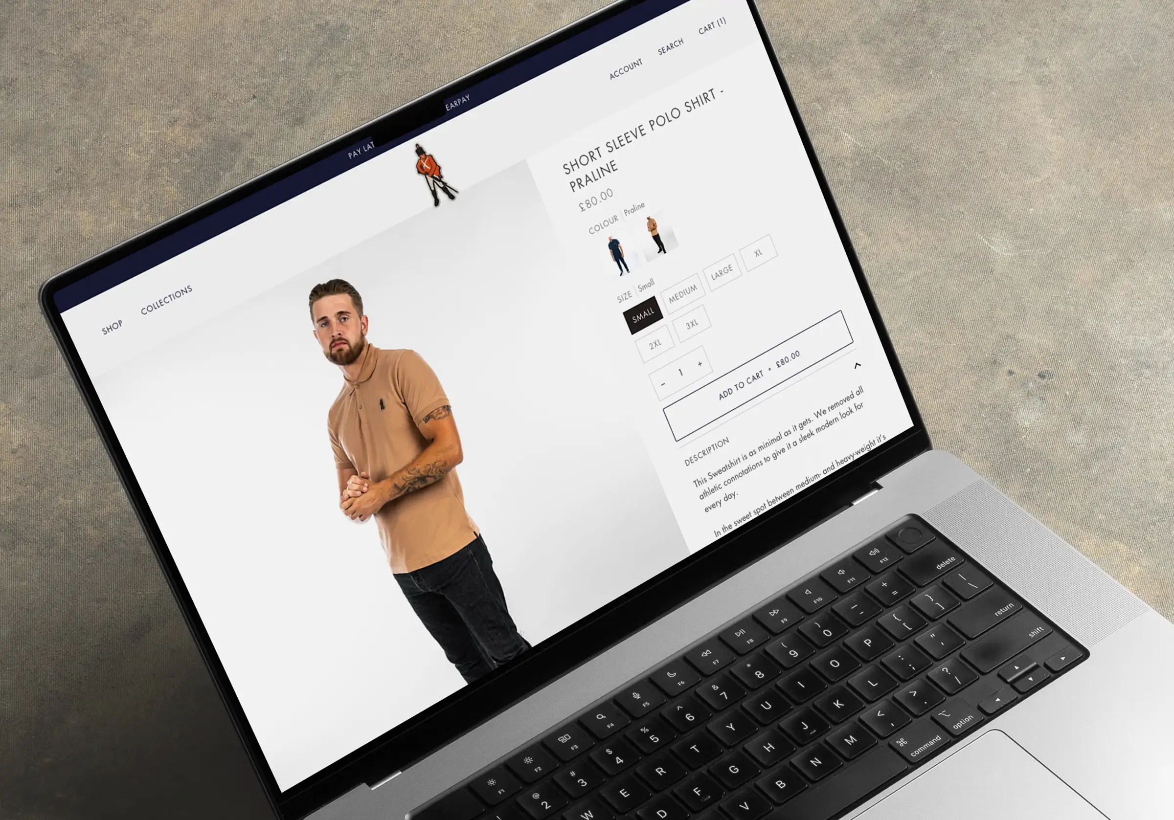
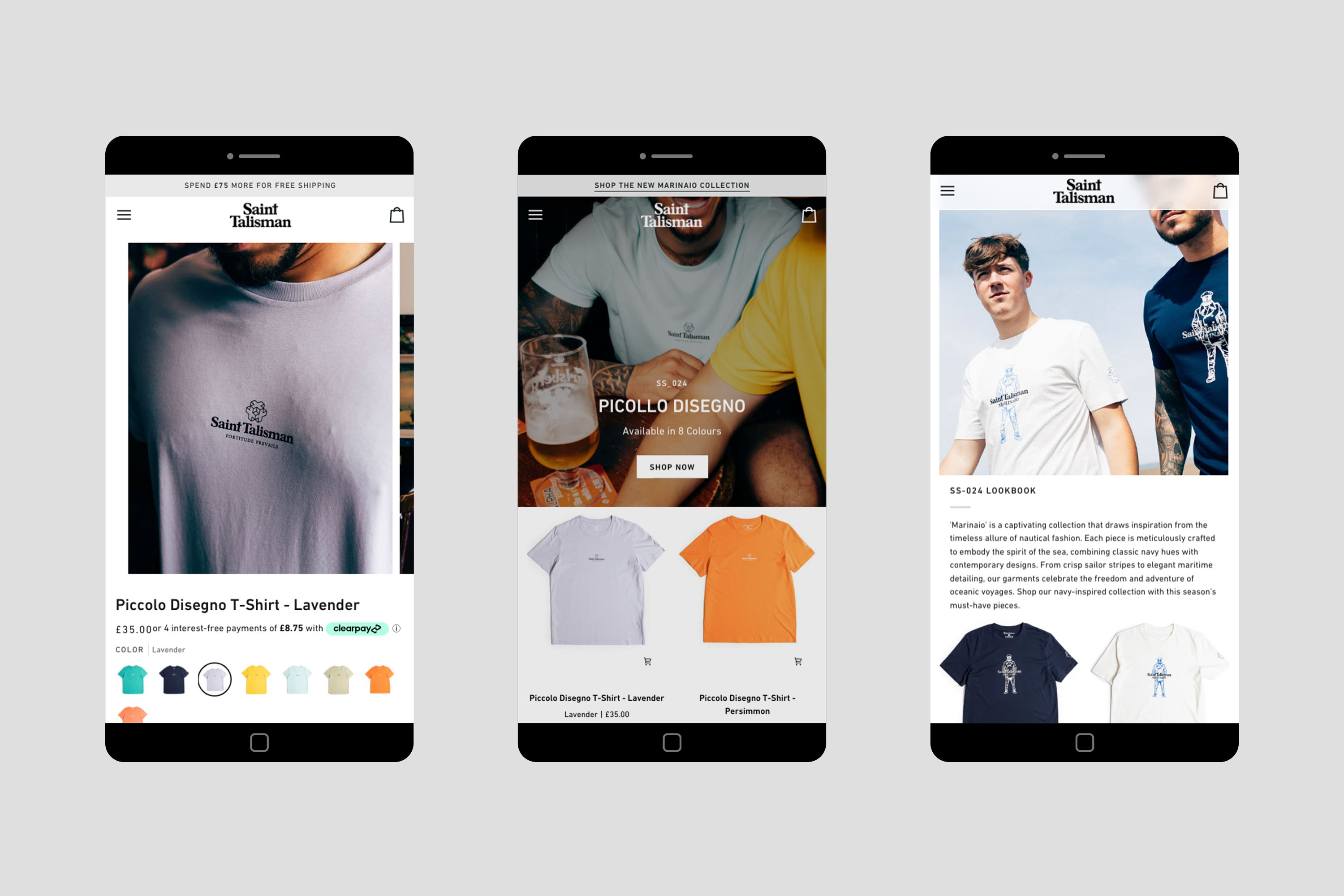
Running a Sale on Your Shopify Store
How to set up, present, and promote a sale correctly.
Running a sale is one of the most effective ways to increase conversions, clear stock, and bring customers back to your website. On Shopify, the setup is straightforward once you understand how their pricing system works.
This guide covers everything from getting your pricing right to making sure the sale is visible in the right places across your store.
Shopify's sale system works differently from what you might expect. Understanding the terminology first will save you time and prevent mistakes when updating products.
How Shopify Handles Sale Pricing
Understanding the terminology before you set anything up.
Shopify does not use the term "sale price". Instead, it uses two fields to create the discounted pricing effect:
The current selling price — what the customer actually pays. During a sale, this is the discounted amount.
The original price before the discount. When this field is filled in and is higher than the price, Shopify automatically displays the product as on sale — showing both figures so customers can see the saving.
When a compare-at price is set, Shopify displays something like £35 £50 on the product page. The strikethrough original price is drawn from the compare-at field automatically — no extra configuration needed.
Setting Up a Sale Collection
An automated collection that updates itself as you add sale items.
Rather than manually grouping sale products each time, you can create an automated collection that adds products to itself whenever they have a compare-at price set. This means once it is configured, it requires no ongoing maintenance.
From this point, any product you give a compare-at price will automatically appear in this collection — and be removed from it when the compare-at price is cleared.
An automated Sale collection means you never have to manually manage which products appear in it. Add a compare-at price to a product and it joins the sale. Remove it and it leaves. The collection stays accurate without any extra effort.
Bulk Editing Products
Apply sale pricing across multiple products at once.
If you are running a promotion across several products, updating them one by one is time-consuming. Shopify's bulk edit tool lets you update pricing across multiple products in a single view.
A product originally priced at £50 on sale for £35 would have: Compare-at price: £50 / Price: £35. Shopify handles the rest — the product will display the saving automatically and appear in your Sale collection.
Promoting Your Sale on Your Website
Getting the sale in front of visitors as soon as they land.
Setting up the pricing and collection is the technical side — but visibility is what drives results. Once your sale is live, make sure customers can actually find it.
Add a Sale Link to Your Navigation
The easiest win is adding your Sale collection directly to your site navigation. Go to Online Store → Navigation, add a new menu item named "Sale", and link it to your Sale collection. This gives every visitor immediate access to discounted products from any page on your site.
Use Your Homepage Banner
Your homepage is the highest-traffic page on your store — use it. Add a hero banner with clear messaging (for example, "Up to 40% Off"), a strong call-to-action button ("Shop Sale"), and a direct link to the Sale collection. This immediately signals value to visitors and significantly increases the number of people who explore the sale.
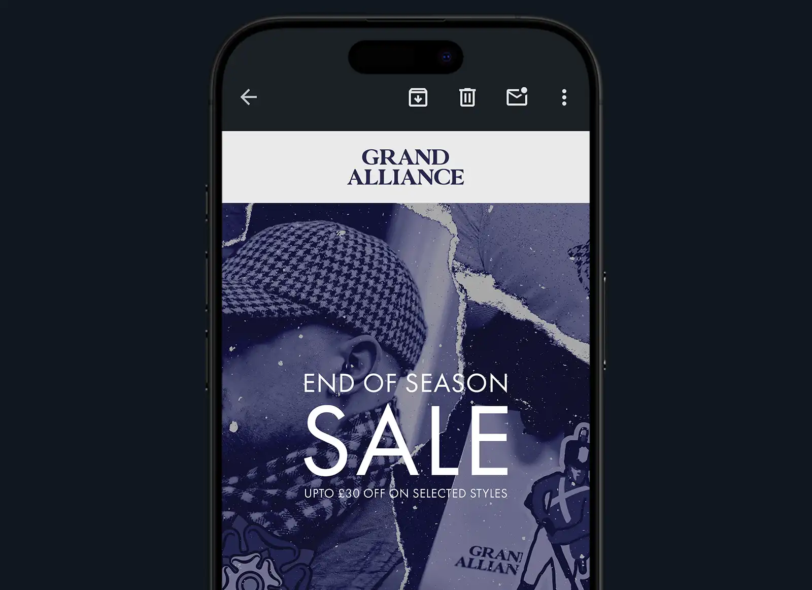
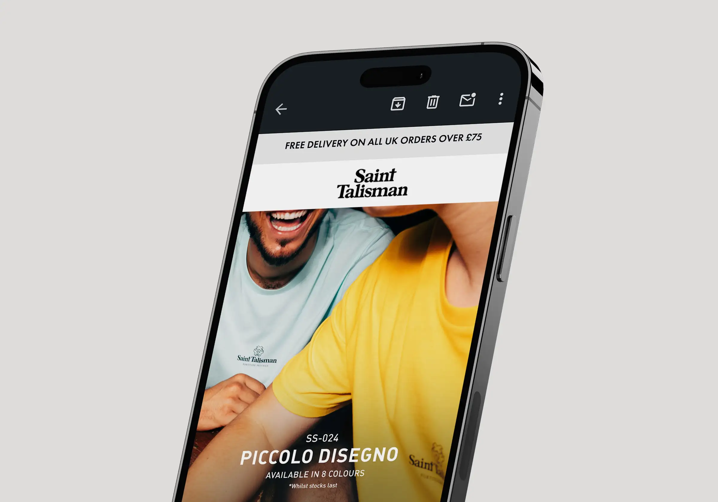
Email and Social
Your website alone will not maximise reach. Send an email to your subscriber list and promote across your social media channels. Both drive traffic back to the site and create a sense of urgency around the promotion — especially if you include an end date.
Tips for Better Results
Small details that make a meaningful difference.
Limited-time messaging such as "Ends Sunday" or "This week only" improves conversions by giving customers a reason to act now rather than return later. If your sale has a genuine end date, make it visible.
Discounting your entire store can dilute the impact and train customers to wait for sales. Highlighting a curated selection of key products tends to be more effective — it creates focus and makes the offer feel more considered.
Round numbers tend to feel more premium, while prices ending in .99 signal a deal. Neither is right or wrong — choose what fits your brand positioning and the products you are discounting.
Before promoting the sale, check that prices display correctly on product pages, the Sale collection is populating as expected, and all links and banners are pointing to the right place. A broken link in a promotional email is a missed opportunity.
From setting up sale pricing and collections to updating your homepage banners and navigation, we can take care of the implementation so your sale launches correctly and looks the part.